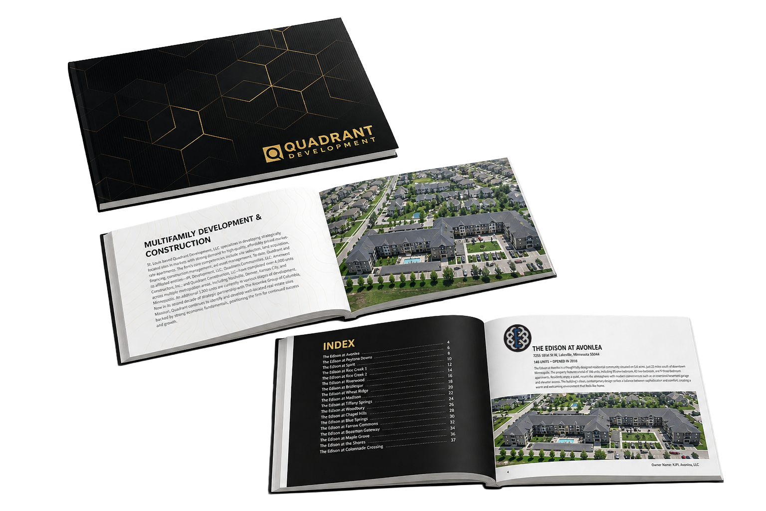
Brand Identity
The Quadrant name carries a sense of precision and permanence — qualities that needed to come through in every touchpoint, from the logo mark to printed sales materials. The visual system is grounded in architecture: clean geometry, understated typography, and a palette that feels elevated without being cold.
Web Design
The website leads with cinematic property footage and lets the communities speak for themselves. Navigation is minimal, the photography is hero-sized, and every page drives toward a single goal: getting qualified buyers to take the next step. Clean, fast, and built to convert.
Farrow Commons